Briggs Burners already had an established logo. However with their push into the online space they wanted a ‘refresh’ of their assets to better cater to an online client base.
They still needed to recognisable to their current customers so I focused on the flame aspect of the logo. The revamping of the flame gave a slick, modern highlight to the logo that could be used elsewhere for their online branding.
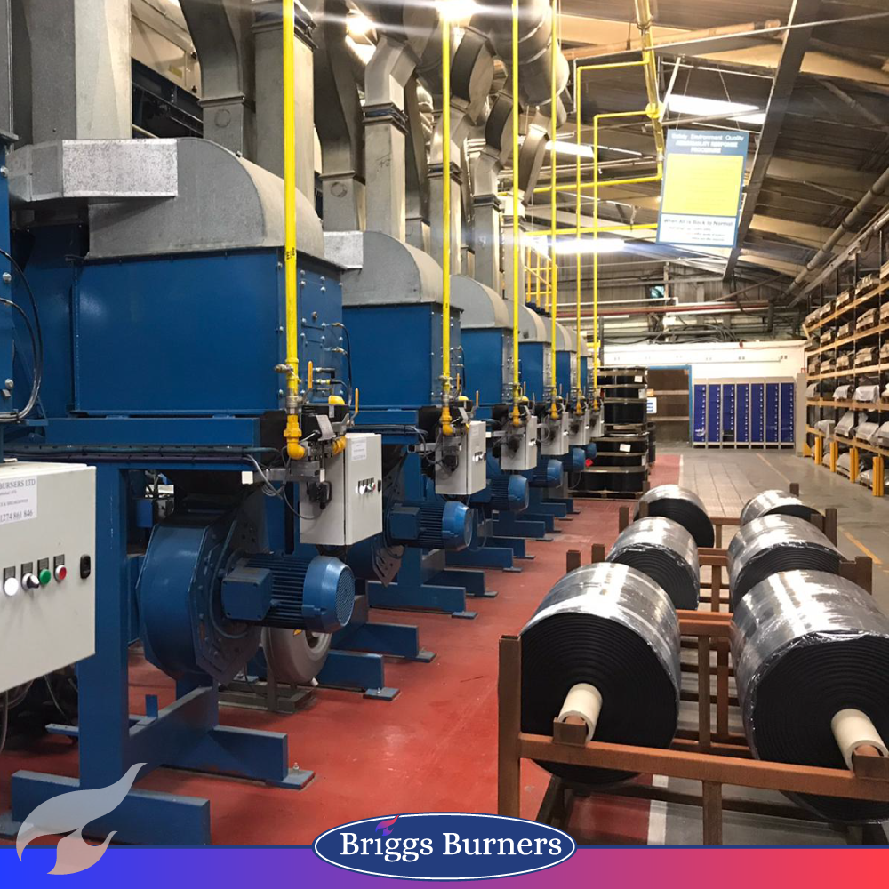
Also the new addition of the gradient gives flow to the flame and lends nicely as a highlight for housestlye implementation across assets.

