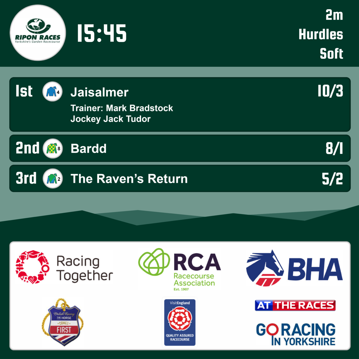
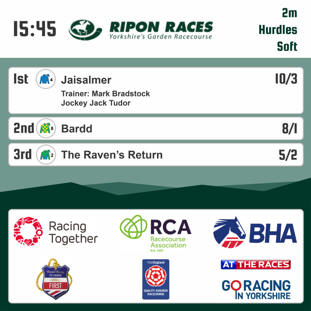
Ripon Races came to me wanting an update to how they show off their race results.
They showed me layouts they liked which allowed me to mock up something that would work on their website and social media.
From here I decided to use their well designed website to influence the mock up as to maintain their brand and housestyle. Making good use of the Ripon Races shades of green, logo and their particular font.
See the 3 designs I came up with, playing around with the same colour scheme and trying out different layouts.


