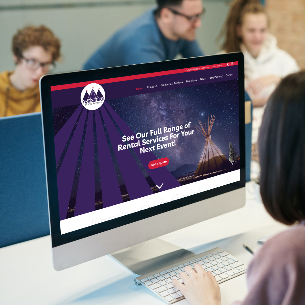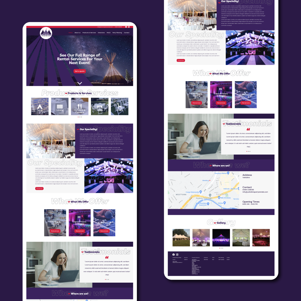

CONCEPT – I fancied flexing some web design muscles on this project. The use case is a party rental business based in Yorkshire wanting a modern website to promote their services.
I designed a logo making use of the tent shapes to imply the rental of tents. And implemented flags with a highlight colour that could be used throughout the websites branding.
Then on the website design I went with a large spread as the homepage to display the important information like “Products and Services”. I made use of the deep purple from the logo throughout as the main block colour and the red as a highlight colour for calls to action and points of interest.
